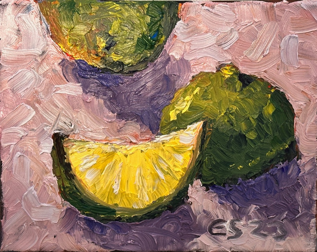
I wanted to paint limes glowing with light. The Limes painting is smaller than Blood oranges, but making it turned out to be more challenging. The blood oranges were painted soon after the limes,
During this painting process, the background of the oil painting gave me some challenges. Here is one example of how some colours just don’t seem to work together. Going back to square one helped in this case.

The first version of the limes was painted on a red background. The background felt a little too strong – almost as if it were on fire. The work came together quickly and I had already signed it. Looking at it, I decided the background needed to be darker. The limes didn’t stand out well enough.

I tried to darken the background by adding blue. The lights and shadows got mixed up. The result was close to a disaster. The old saying “don’t overwork a painting” echoed in my mind. The background was now completely ruined. If I had let go of the work earlier, I wouldn’t have ended up in this mess.

While the paint is still wet, it’s easy to go back to square one. Oil paint is an easy medium in the sense that you can “carve” everything off with a palette knife if you want. I decided the work would get a completely new background colour, something that felt good. In my opinion the result turned out perfectly.
