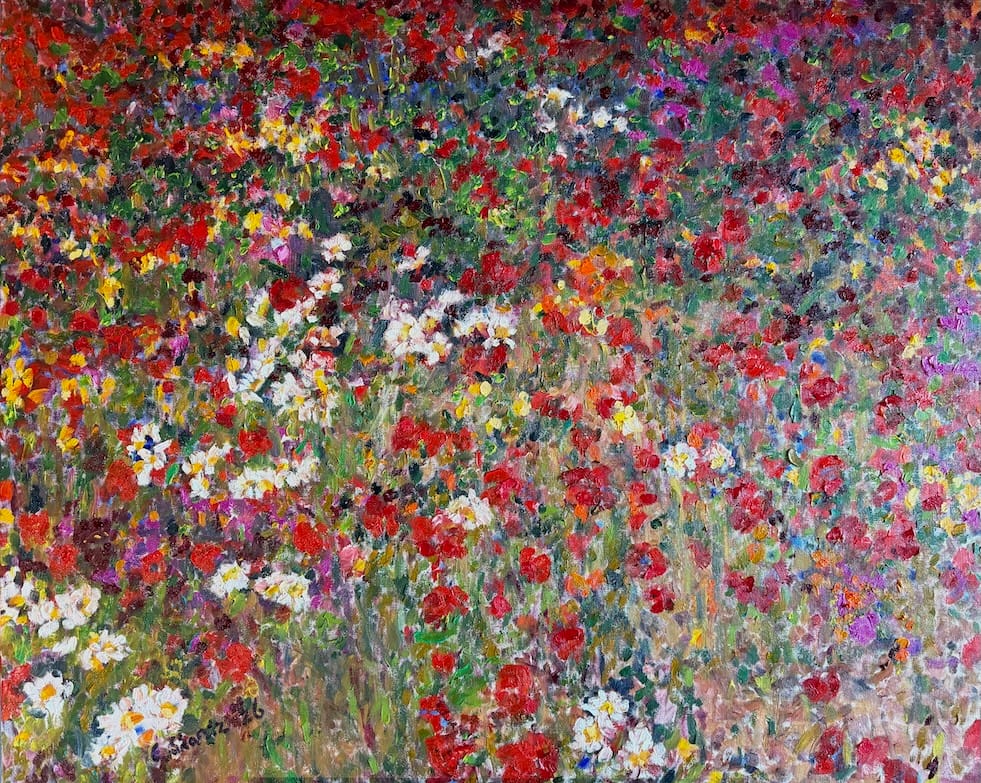
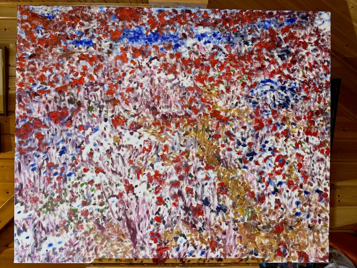
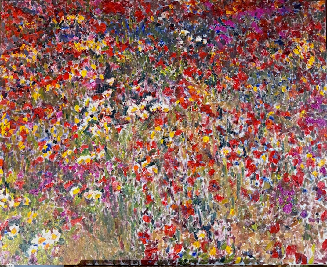
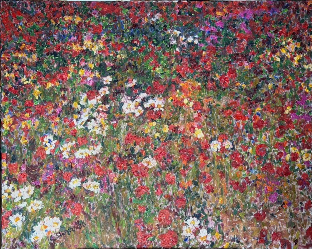
I’ve become quite passionate about helping all the animals of the forest, and meadows are an important part of that ecosystem. So it was only natural that one meadow ended up as an oil painting. This one turned out better than I expected – it feels as if a sunny summer day is basking in the meadow.
The painting started with a rather bold underpainting. Already at this stage, you can see at the top how I began sketching in the sense of distance towards the upper edge.
Here it is a day later. The daisies have found their places, and the light and shadow are starting to fall into place.
Two months later, I was able to get back to the painting. Now it’s finished, and it’s lovely to admire as the light plays across it in different ways. The painting always looks different depending on the light.
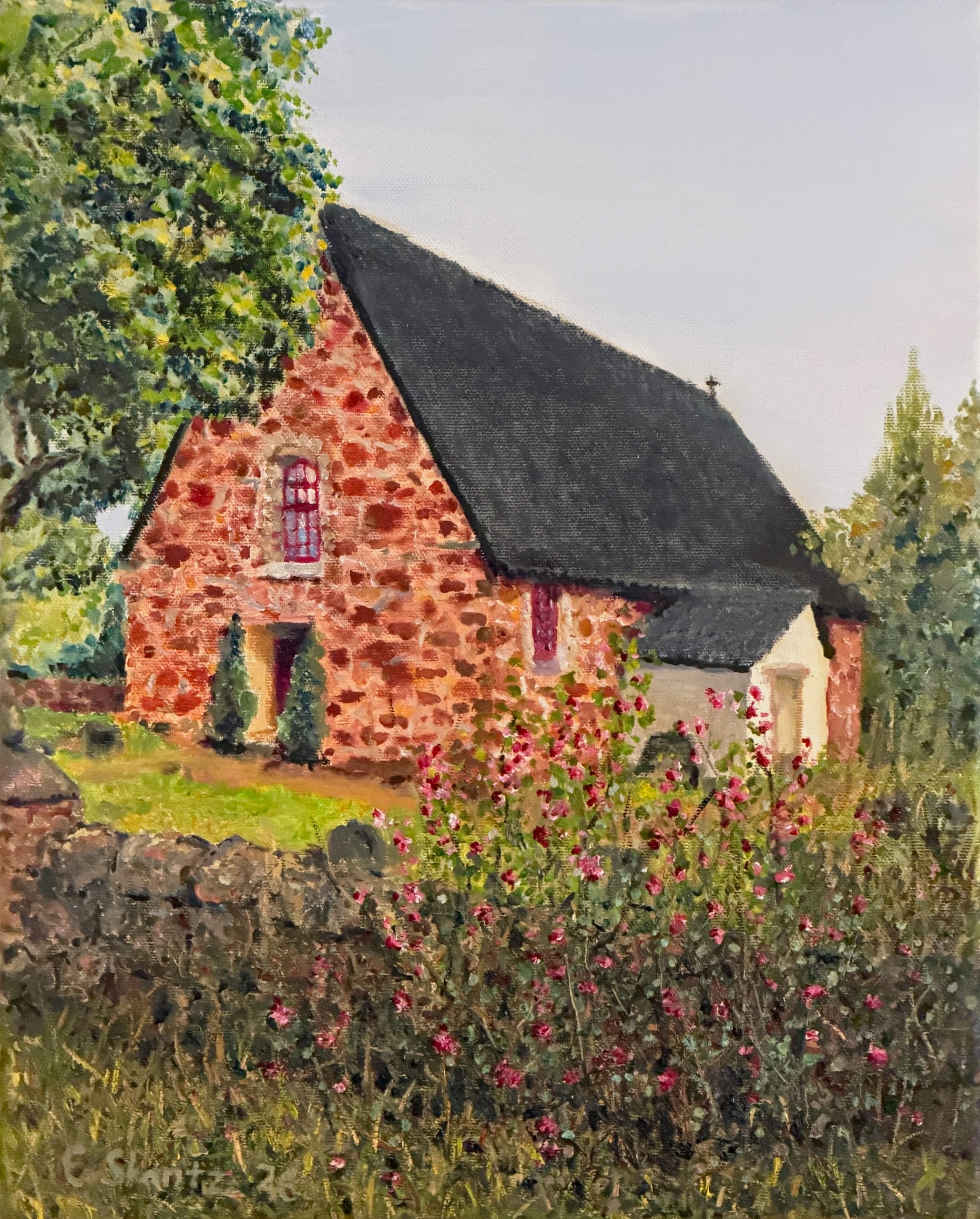
I followed in the footsteps of my ancestors in Åland in June 2025, and captured Geta Church in an oil painting.
This place means a lot to me, because my great-grandfather moved to Finland from St Petersburg as an orphan and at some point ended up in Åland, in the municipality of Geta, in the late 19th century.
I thought it would be wonderful to visit a place where my great-grandfather must surely have been in his time.
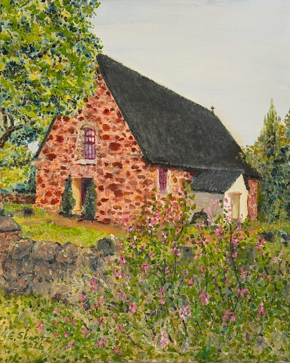
In this painting I also wanted to bring out the plants around the church. It felt natural to depict blossoming life. In the foreground is a Japanese quince, which, as its name suggests, originally comes from Japan.
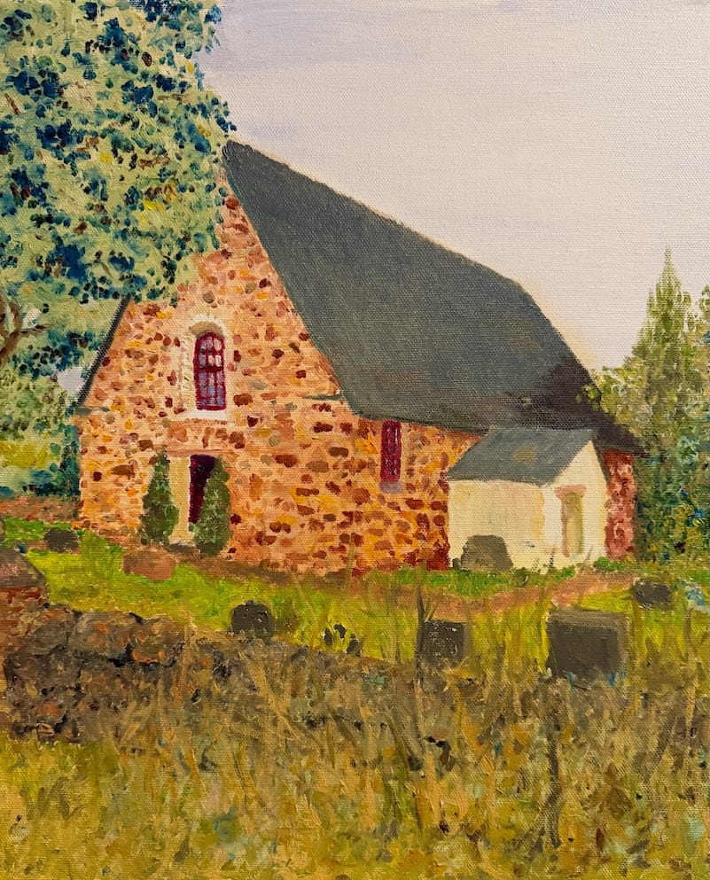
I started this painting in January 2026 by sketching the background. At this stage the church was the most important part of the painting.
In the picture below, the painting had already come quite a long way. According to the timestamps on the photos, it took three days to get to this stage. I’d estimate I spent two or three hours a day painting. In my opinion the church is already almost finished.
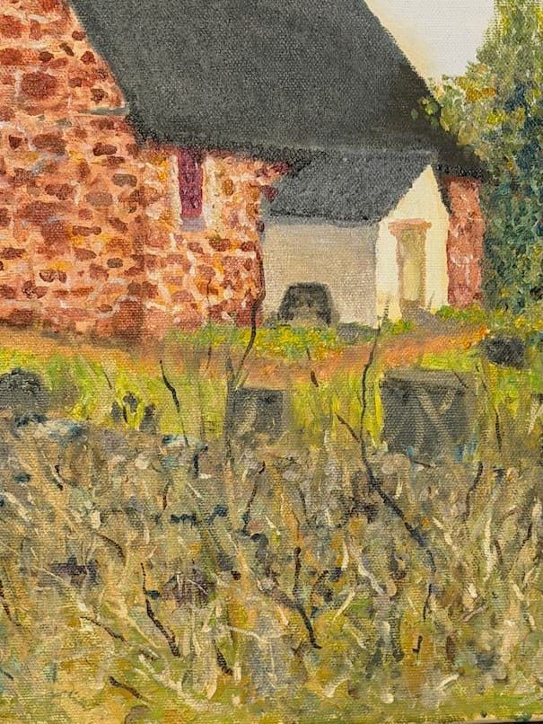
The painting was left to dry for a couple of months, after which I started sketching the plants in the foreground…
In April the Japanese quinces got their first form.
I thought the painting was already finished, and the oil painting did hang on the wall for a long time… Still, it felt as if something needed more work. I decided to strengthen the contrast in the foreground, since it was in the shade of the trees. I also wanted the church itself to stand out better.
The painting was finished on 8 October. Here is Geta Church. A tribute to the generations that came before.
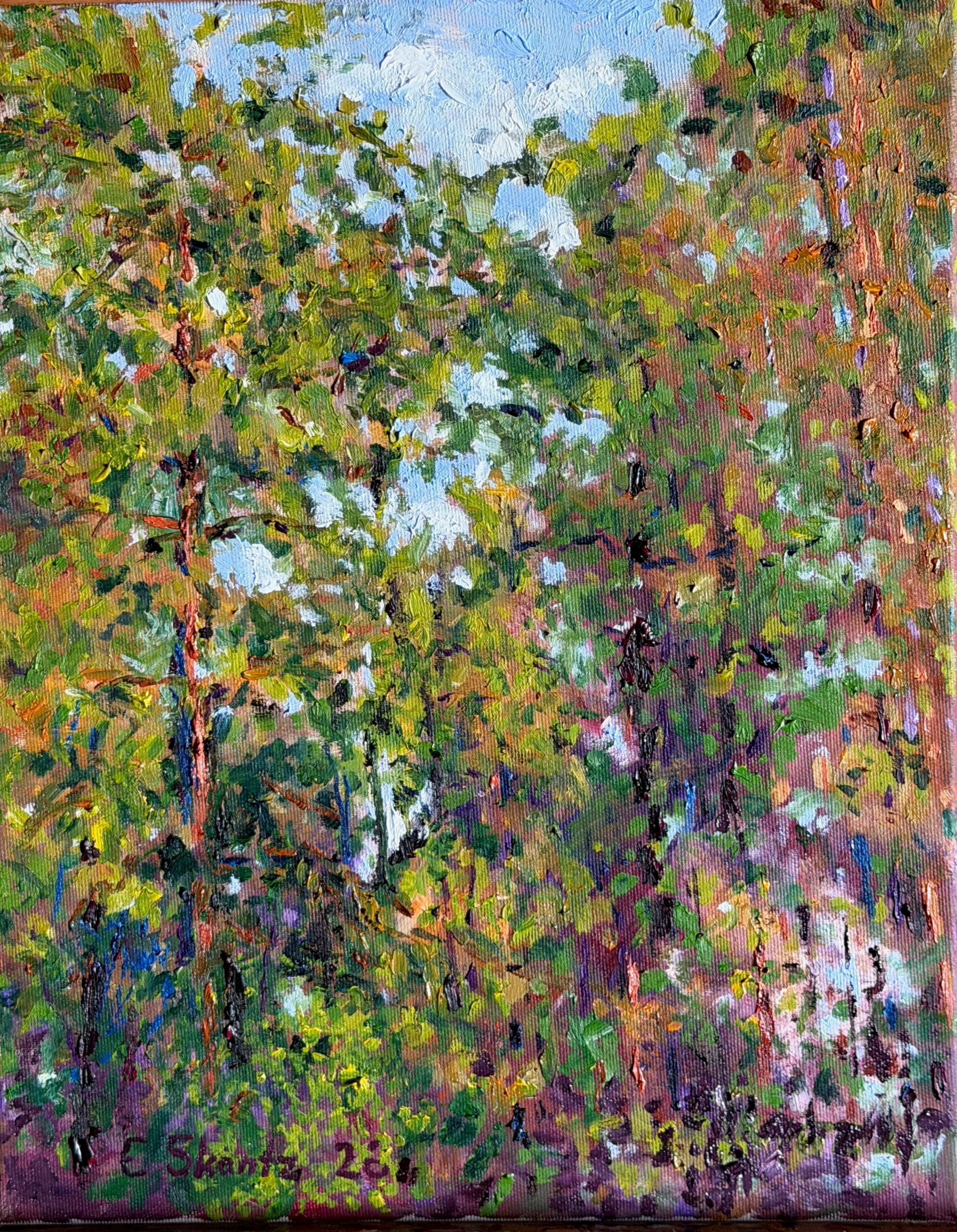
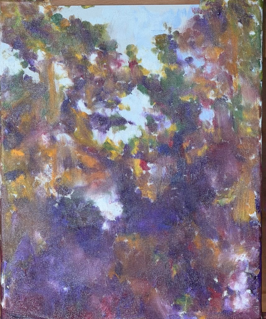
With this oil painting everything flowed like a dance. A lovely background made it possible to create a fun, lively painting. Here is the base layer left in the background, which I painted weeks before the actual trees joined in. The background itself looks fascinating too.
It’s super fun to keep adding all kinds of interesting dimensions of colour to paintings. You can highlight things that busy people just can’t see in all their hurry.
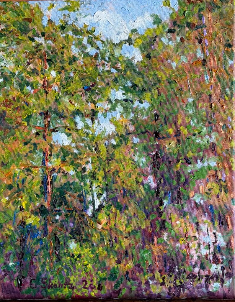
Once the oil paint had dried, I painted the actual greenery, which – like everything – fades away with the autumn.
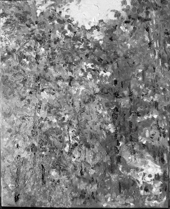
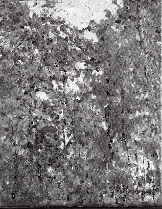
With this painting I discovered an interesting way to test how well a picture “stands out”. Take a photo of the painting and switch it to black and white – if the painting looks like “flat porridge”, you need to think about which details to emphasise. Here it is before and after I added a little more contrast to the trees.
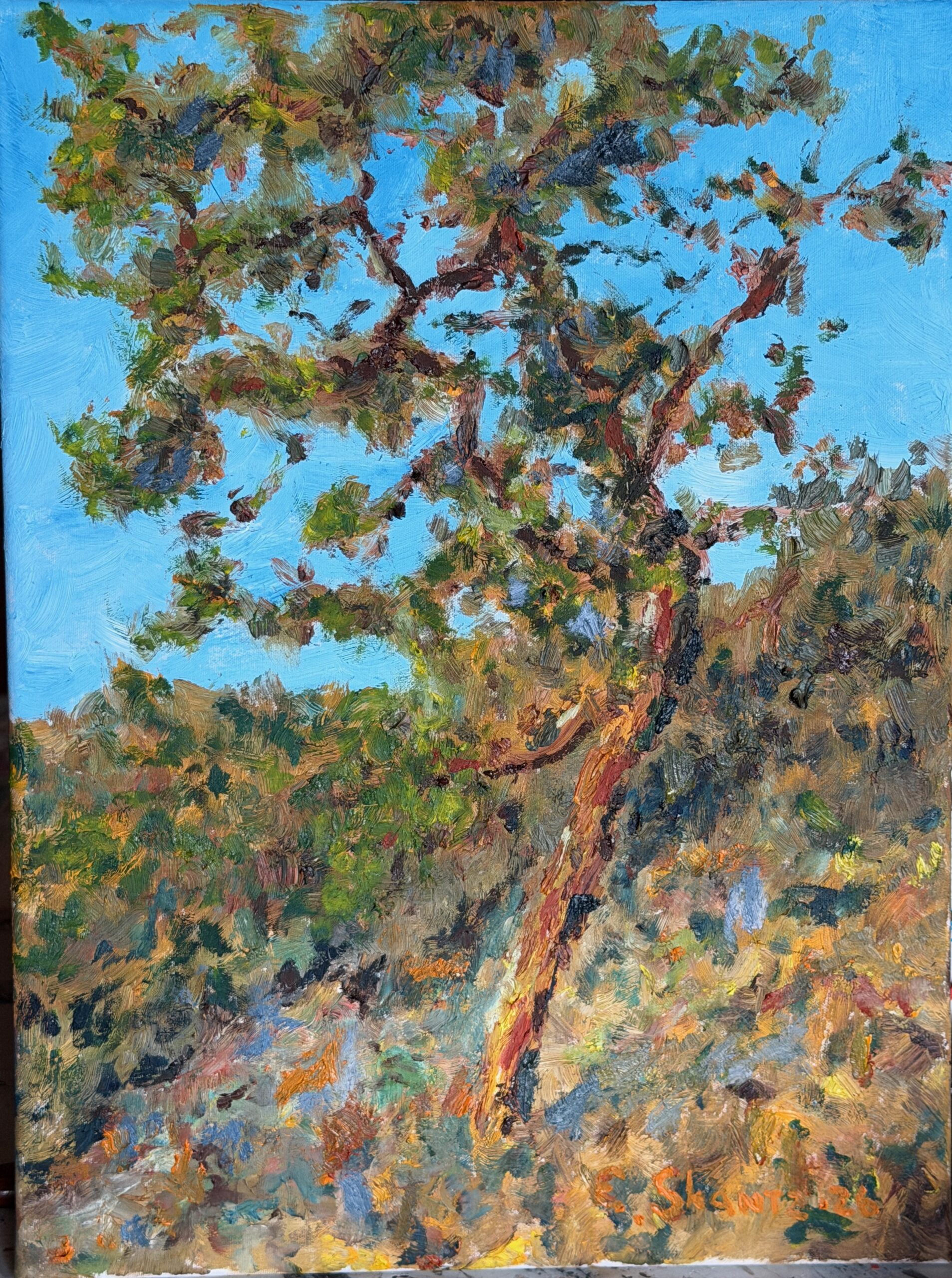
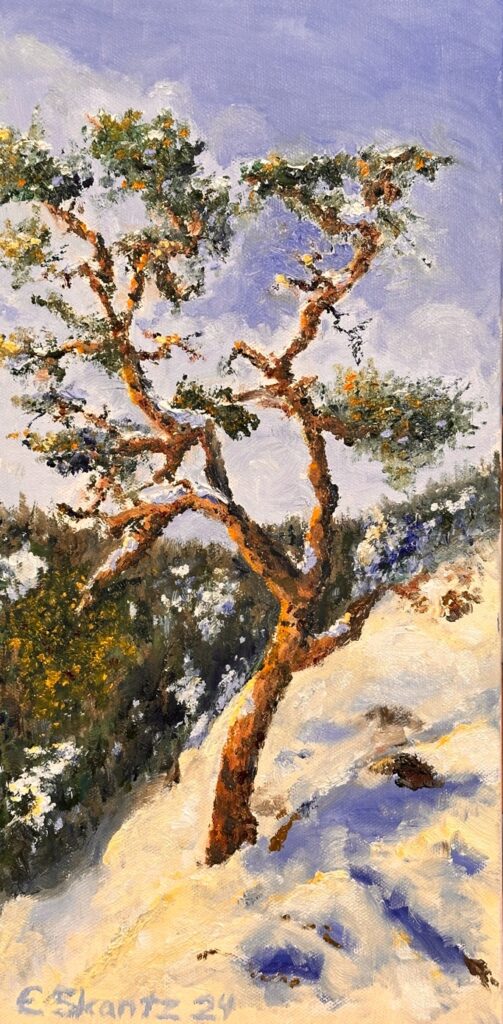
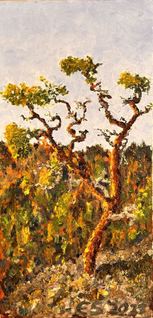
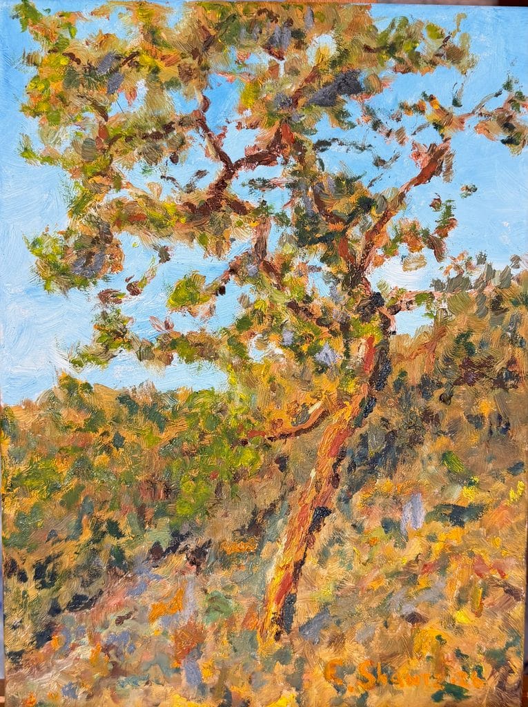
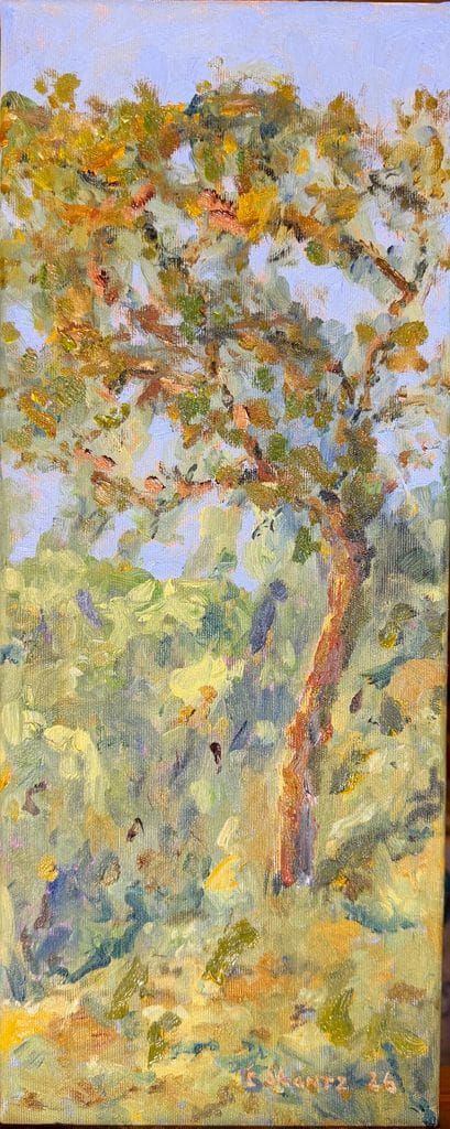
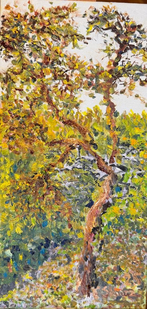
I’ve painted this pine many times. Here are five different perspectives on the very same pine.
This winter landscape, painted a few years ago now, is about the balance of opposites. Pure, light-reflecting snow creates a bright backdrop for the old pine, which glows with its own warmth in the middle of winter. For me, the work is a reminder that even in the coldest moment, we can find softness and a quiet, homely warmth around us – and within ourselves.
This pine above, bathing in colour, takes me back to the time when I was taking my first steps in oil painting. In the early days it often felt as if the most beautiful works were born almost by accident, through the power of intuition. This painting positively radiates the gentle warmth of a late-summer evening.
Above is a pine I captured on canvas in early summer ’26. The horizon of the work fairly breathes the lushness and warmth of the coming summer. I find it fascinating to see how the same familiar tree changes shape and how many ways there are to depict it. The series will continue soon – a fourth work of this very same pine is on its way here shortly!
The pastel-toned oil painting above was made in summer 2026. Somehow it too has a pleasant, warm spirit. A calming moment, in a way. I hope you can feel the same?
This one below (the very same pine), on the other hand, comes across as sharp and energetic. At moments even a little off-putting. This early-spring painting shows beautifully how powerfully nature comes back to life in spring.
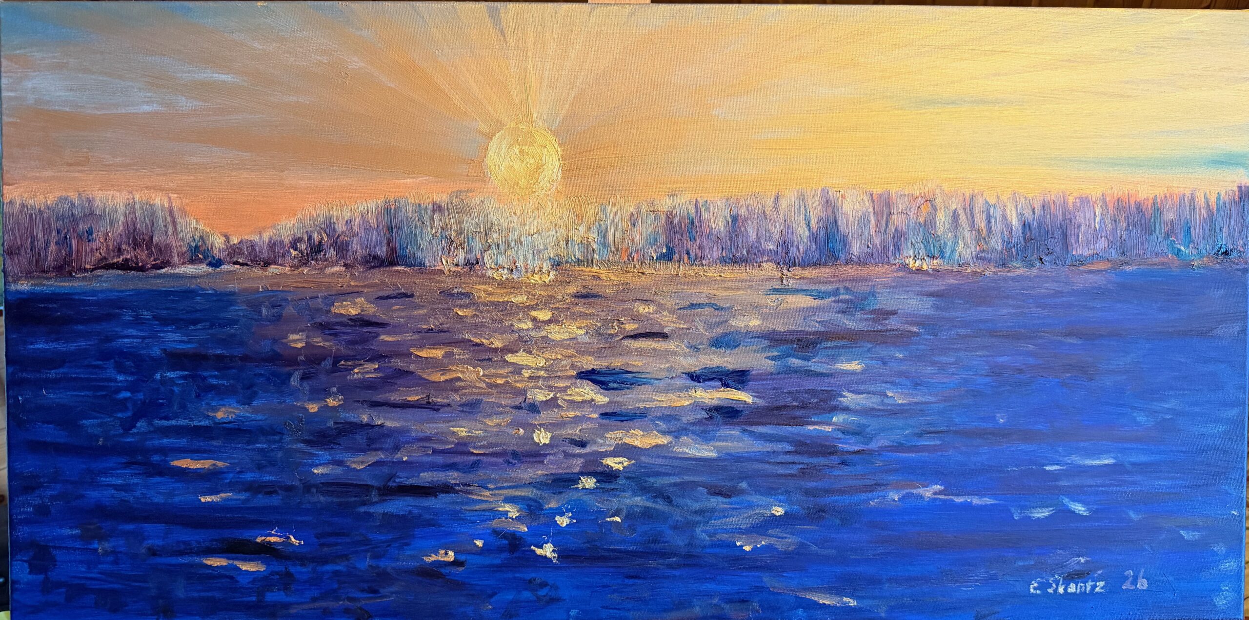
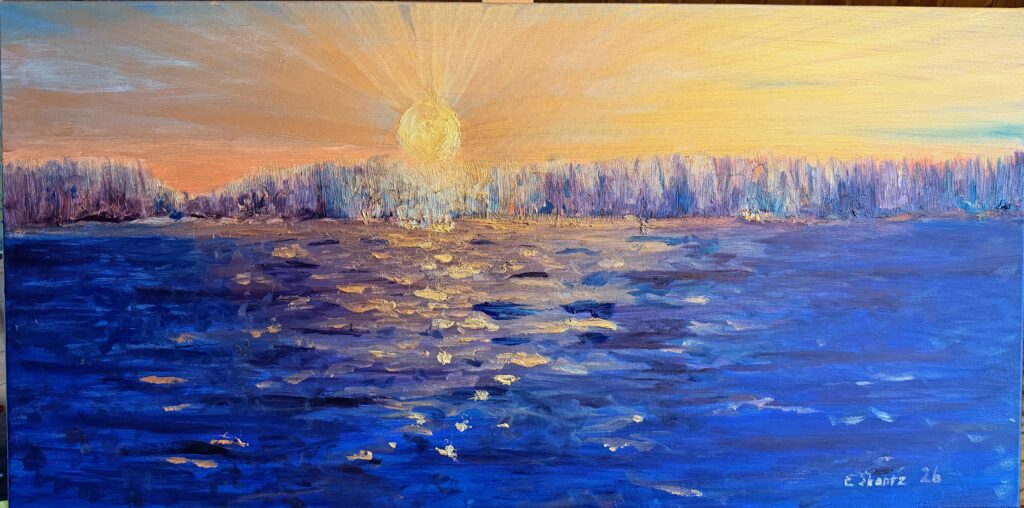
When painting, you sometimes know within the first few strokes that something good is coming. With this painting, though, the process was longer and a bit more complicated. I started the work the previous year, but the subject or the colours just didn’t quite work. Still, there was something in the colours that I liked, so I let the painting “mature” at the summer cottage for about a year.
I had some gold paint and had long been wondering what to use it for. When I took the painting up again, I decided to use gold in this sunset. I applied the paint really thickly so that the golden rays of the sun would show properly. At last the painting found its final form.
From the original version, the sea and a faint pale-red horizon remained visible. The horizon and the sun changed from deep yellow into two different shades of gold, and the gold now almost completely covers the old horizon.
The painting doesn’t do itself justice on a web page, because the gorgeous shimmer of the gold doesn’t show in photos the way it does in real life.
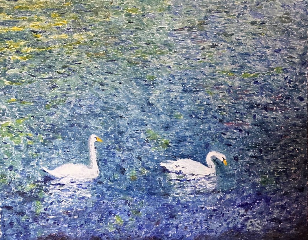
This work is one of the first in which the joy of painting and the thrill of success really burst through. I felt that I could truly succeed at painting. The painting came out well almost by accident. I put paint on the canvas and – look – everything I wanted to show is right there as proof. This oil painting was made in 2023.
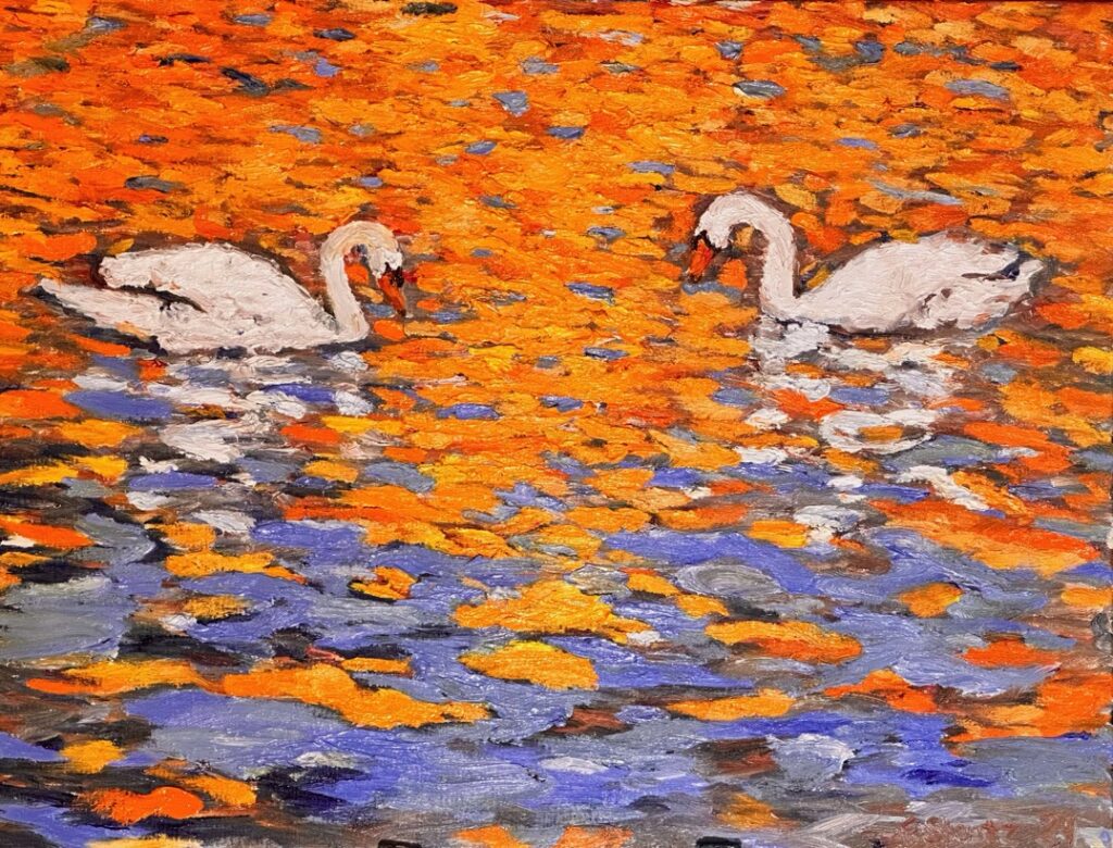
I’ve been able to follow the life of swans for years – those majestic birds have always fascinated me. Now they’ve earned a worthy place on a large, striking canvas, where they get to guard their territory. Below is a newer version of the swans. Both swan paintings are large and eye-catching. This orange sunset was painted in 2024.
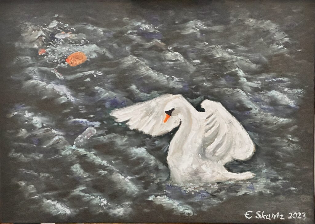
The oil painting below is a little darker. It reflects the pollution of our planet. We all have to live in the middle of waste. In this painting, too, the swan lands among the rubbish.
In this work I took my first steps in painting waves; the movement of the sea is already starting to take shape in the waves. In the two previous paintings I didn’t capture the waves of the sea, only the reflections in the calm water by the shore.
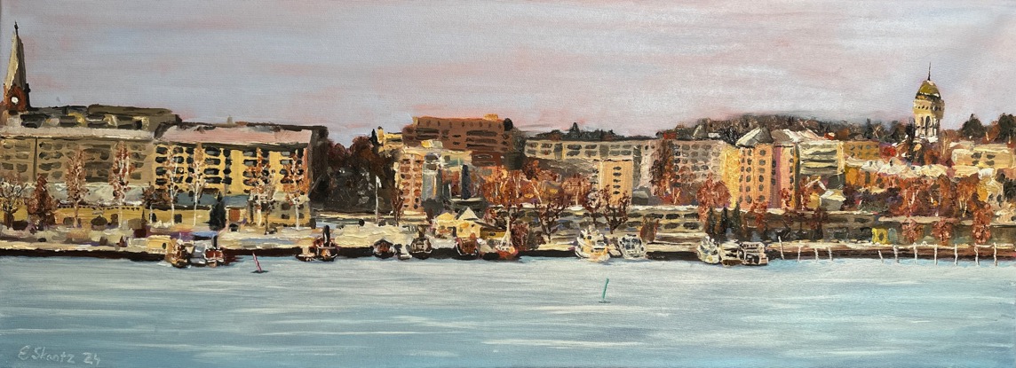
Sometimes you can tell right away that a painting works. That’s what happened with this one. My idea was to paint a wintry landscape of Mikkeli. In the base layers I was after a little of the sun’s warmth and the coldness of the ice
This work was an interesting “memory game”. While painting I constantly had to check what a certain side of a building or a window really looked like. The large shapes were easy to do, since my loose style didn’t get hung up on time-consuming details.
Here the oil painting is already starting to take shape. The shadow in the sky comes from the easel.
In my opinion, the finished oil painting of Mikkeli works beautifully.
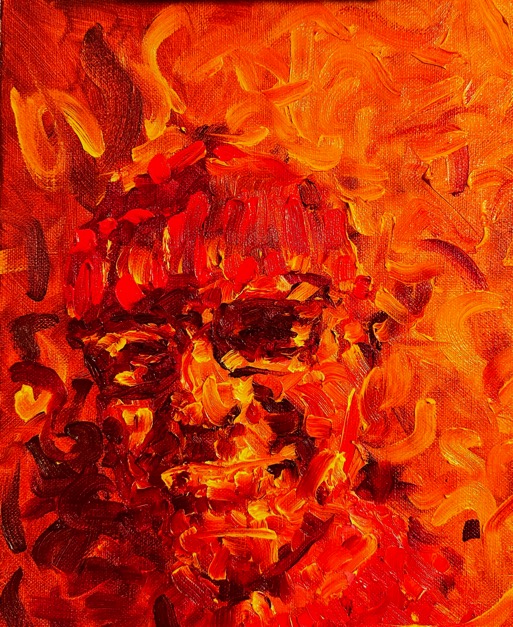
Painting selfies in oils is fun. Getting feedback on the paintings is fun too. When giving feedback, viewers often reveal something about themselves, their values and their thoughts that comes to the surface through the paintings. This picture has even been described as burning in the fires of hell. I call the painting Flamehead myself.
I made this oil painting in April 2024.
At first the work was more “polished”, but it seemed so tame that I decided to give it more “oomph”. As you can see above, the picture shows me laughing with a red beanie on. That orange tone made the work more flame-like. This oil painting is one of my own favourites.
The feedback I’ve received on this painting has taught me a lot. “Why are you on fire?” “Are you in hell?” and so on. These days I feel it really doesn’t matter what or how you paint. Viewers always look at pictures from their own starting points. When I hear feedback on my paintings, it works as a kind of mirror of the viewer’s soul.
Paintings reflect the viewer’s own experiences and values. Maybe that’s why so many people see some kind of hell symbolism in this one as well. In reality, “yours truly” is on fire because life is so amazing!
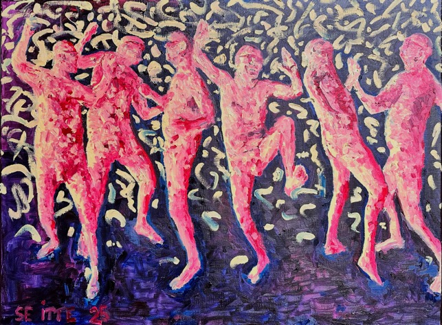
This is the finished painting, moments before the “Se itte” signature.
Joy, delight, having fun, endless possibilities… They are all inside every one of us, once we first learn to stop. When the mind is in balance, this is the kind of result you get.
This oil painting is made using three colours. The dark background is Prussian blue, and “yours truly” x 6 is dark wine red and pale yellow. That’s all it takes to get the party started!
Taking photos of paintings with a phone is sometimes frustrating – the camera seems to distort the colours. The picture above, too, has colours that aren’t in the actual oil painting. On the other hand, one of the great things about oil paints is exactly that glow of colour, which the camera unfortunately distorts.
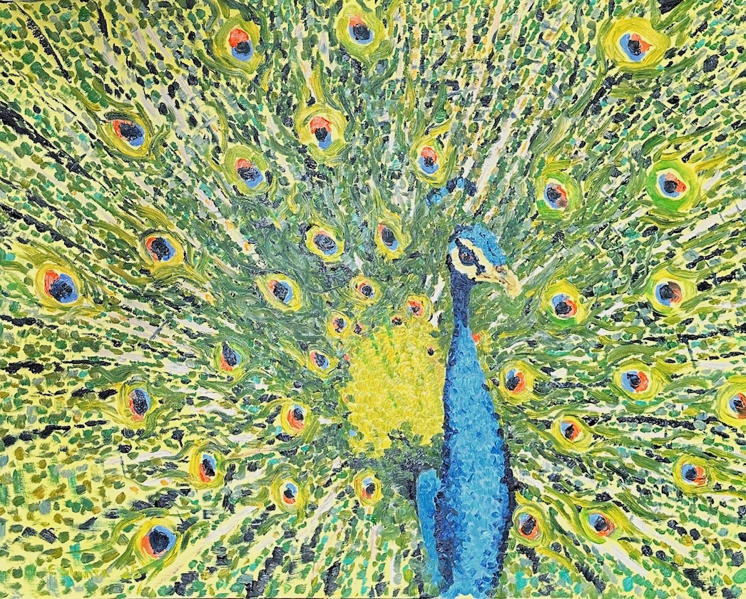
Sometimes you get the feeling that a certain painting simply has to be made. The peacock was exactly that kind of feeling – for one reason or another I just had to paint it. I thought I could make a real “through the roof” painting, and that’s exactly what it became.
In real life the picture practically jumps out at you. I made this work in May 2025. An interesting technical detail you don’t notice right away is that the background colour of the whole painting isn’t green but bright yellow.
When I started the painting, I wondered how the yellow would work in the background. Looking at the finished painting now, you can see that it pays to be bold with colours and just go for it. Here is the finished peacock oil painting.