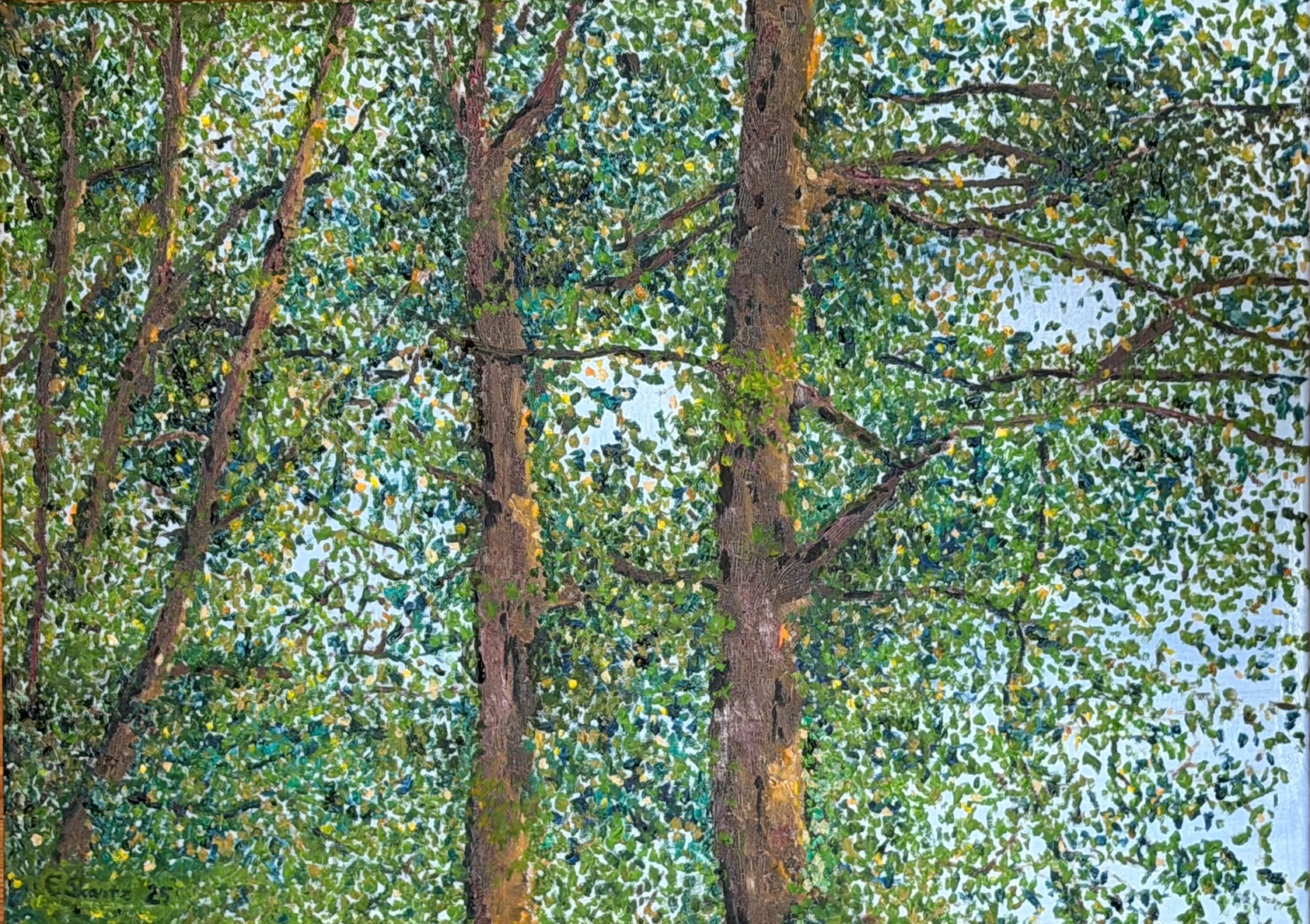
The idea for this painting came to me while I was looking out at the sea from the cottage window. Suddenly I realised – why go far to look for something when there’s something fascinating right there on the shore? The alders became the subject of this oil painting. I painted it in summer 2025. The use of colour in this painting is interesting – among other things, I used red in the alder trunks.
I painted the alders so that the light blue sky and the sea served as the background. I thought it was enough for the background to be very simple, since the leaves of the trees work well as effects of light and shadow. The different shades of blue don’t separate the sky and the sea in the background.
Above is the almost finished painting. In the finished painting I faded out that dark branch from the lower part of the right-hand alder’s trunk. In the finished painting you can clearly see how the blue sky and sea and the yellow leaves create green leaves in different shades.
What happened with this painting was that I painted brown onto the tree trunks before the layer underneath had dried. As a result, the top layer of paint started to crack.
This “accident” made the tree trunks look really interesting. If you zoom in on the picture below, you can see the cracking.
Maybe you can also imagine the alder leaves trembling gently in the wind?
It’s amazing how the idea for a painting is born. The idea of painting a cow felt important. I’ve never really had the chance to get to know cows. I know cows sense things, somehow in the same way as people do. I hope one day I can be there to watch when the cows are let out onto their spring pastures. I expect to see joy and delight as the animals enjoy their freedom and nature.
I remember how as a little boy at my grandma’s I was ordered out from under everyone’s feet so I wouldn’t disturb the milking. Grandma had (if I remember right) two cows. Somewhere deep in my mind there’s still the taste of viili and creamy, delicious milk…
My aim was to capture the moment and the feeling of how an animal can look at a person. The subject of the painting worked out beautifully. The painting process itself, however, wasn’t quite so easy. As a base for the painting I picked an old painting of mine in which I had painted tulips. For one reason or another the tulip painting didn’t work, and it got a wonderful new life as a cow painting.
Here was the first version of the tulips. My original idea was to make the painting with as few brushstrokes as possible. But the painting didn’t feel like mine, so I decided to give it a bit more “oomph” and “vibe”.
Above is the same painting with “oomph” and “vibe”. This one already felt a little more like my own. Still, something in the painting was off, so I decided to sacrifice it on the altar of art. After the painting had dried for a few months, I sanded off the highest ridges of paint and started a new painting…
Cow
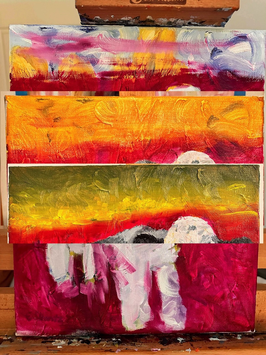
Here is the first version of the cow. I really took to the animal, and my first thought was to paint a green meadow. The red was my effect. I thought I would leave the red as a base and paint the different shades of the meadow on top. I didn’t like the blue sky at the top of the painting, so I decided to redo the sky.
At this point I realised that changing the sky into different shades didn’t make sense. The yellow sky didn’t work as it was. My original idea of a green meadow also went in the bin. Somehow the creature just stood out better against that red. I tried one more variation for the sky…
A rising or setting sun didn’t work in the murky “night” tone. Once again I had to go back to square one. The painting process can sometimes seem frustrating. In reality it wasn’t, because the subject of the painting itself worked. I just had to find colours that worked well together as a whole.
Here it is! Finally a finished work – now the sky works beautifully with the red meadow. And that’s how the tulips turned into a fine cow.
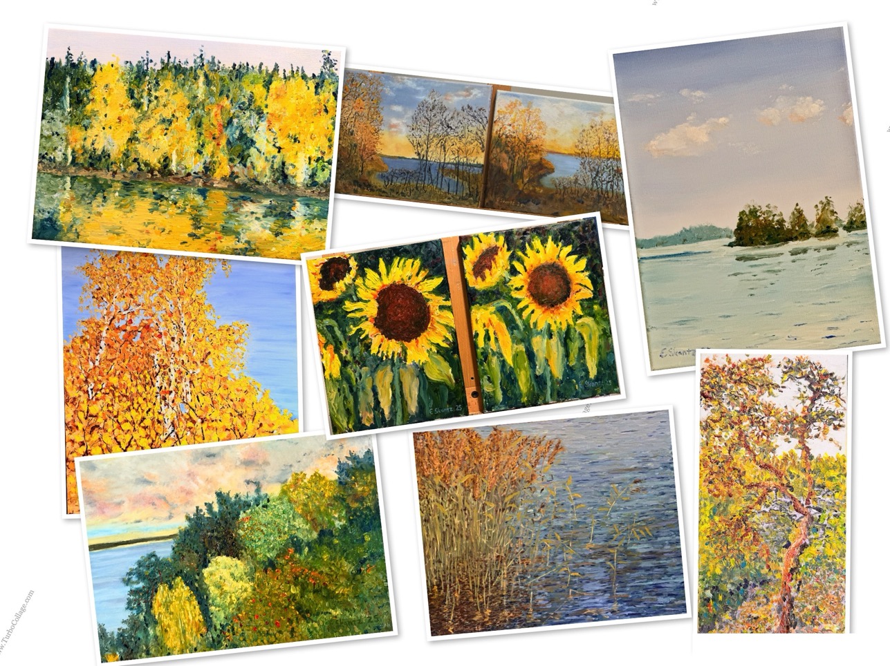
In 2025 I made several nice oil paintings. I thought I’d put a few pictures of my paintings here. It’s also nice to see how my painting technique has developed now that I have a couple of years of painting behind me.
This first one is a summery reed bed from the island where our summer cottage is. It radiates the warmth of summer and the glow of the sea. The surface of the water turned out really lively. If I remember right, this painting is a metre wide and 80 cm high. This painting is one of my own favourites.
I’ve painted several birch-themed paintings. This one is a birch grove I often look at in Korpikoski. It’s a skill of its own to be able to stop and see beautiful things even in everyday life. Often we don’t see beautiful things because our heads are buzzing with all sorts of thoughts, and we don’t notice the wonderful things in the present moment. In this moment, autumn has already progressed so far that the birch leaves have turned yellow. I’ve made three oil paintings of different sizes of these birches, and this is the largest of them. 1 m x 80 cm.
These two paintings were born as an experiment to see how well I could paint a landscape where the sea shows through the trees. One of them was the first draft on a cheap canvas, and the other was on a better-quality canvas. The idea was to do a test on an inexpensive canvas first and then the actual work on a better one. The view is from the porch of our summer cottage – once again an autumn landscape. I can’t say which of the paintings came first.
These sunflowers were painted over two days. On the first day, one of the paintings had a glass vase, but while painting the other I realised the flowers worked better without a separate vase. Luckily oil paint is forgiving in that you can wipe it off and cover it up fairly easily. One painting served as the model for the other. Many things get better when you take a little distance from them – and so it was here. On the second day the paintings got a little more stylising and were then finished.
This calm day is a view from Lake Korpijärvi. The cool colours of the painting even make it look a little like a winter landscape. Seen from further away, the reflection on the water works nicely in this small painting. We have several different paintings of this subject too. This Korpijärvi oil painting measures 33 x 23 cm.
Here is another small oil painting of Lake Korpijärvi. This time we’re back in more autumnal scenery. This view is directly across the water from the sauna. You can almost see the water flowing towards the Korpikoski rapids.
I’ve painted this pine in different seasons. This summery pine is a small and fairly simplified painting. For some reason this pine fascinates me – there will be many more versions of it…
I always find myself gazing at this valley while admiring the view over the Airisto. Here the autumn colours are beginning to glow, and the rowan berries shine red. This fairly large painting works better in real life than as a digital photo. Still, I believe the idea of the painting comes across in this picture too. I hope you can sense the last warmth of summer in it… At some point this painting will get a little retouching, as I don’t think some of its dark areas quite work right now.
At some point I’ll update the pages and the final painting will appear here.
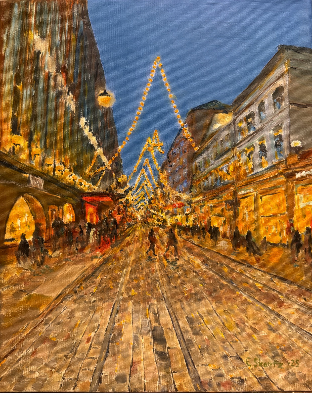
I visited the Ateneum again, and one painting caught my eye with its almost comic-book-like perspective. I’ve made a few comic strips, and I realised the same comic-style effect could be used in an oil painting too. After our visit to the Ateneum we walked across Aleksanterinkatu, and I snapped a photo of that moment, which you now see captured here. The painting isn’t really a comic strip as such – for some reason the comic just inspired me to paint this moment.
I often hear people say, “I can only draw stick figures”. While painting this I chuckled that these people – if you took them out of the picture – wouldn’t even be recognisable as stick figures. Somehow, though, the eye and brain still form an image of people.
Here is the finished work. The darkness and gloom of December turn into a celebration of light in the shop windows. Aleksanterinkatu is an oil painting measuring 41 cm x 33 cm.
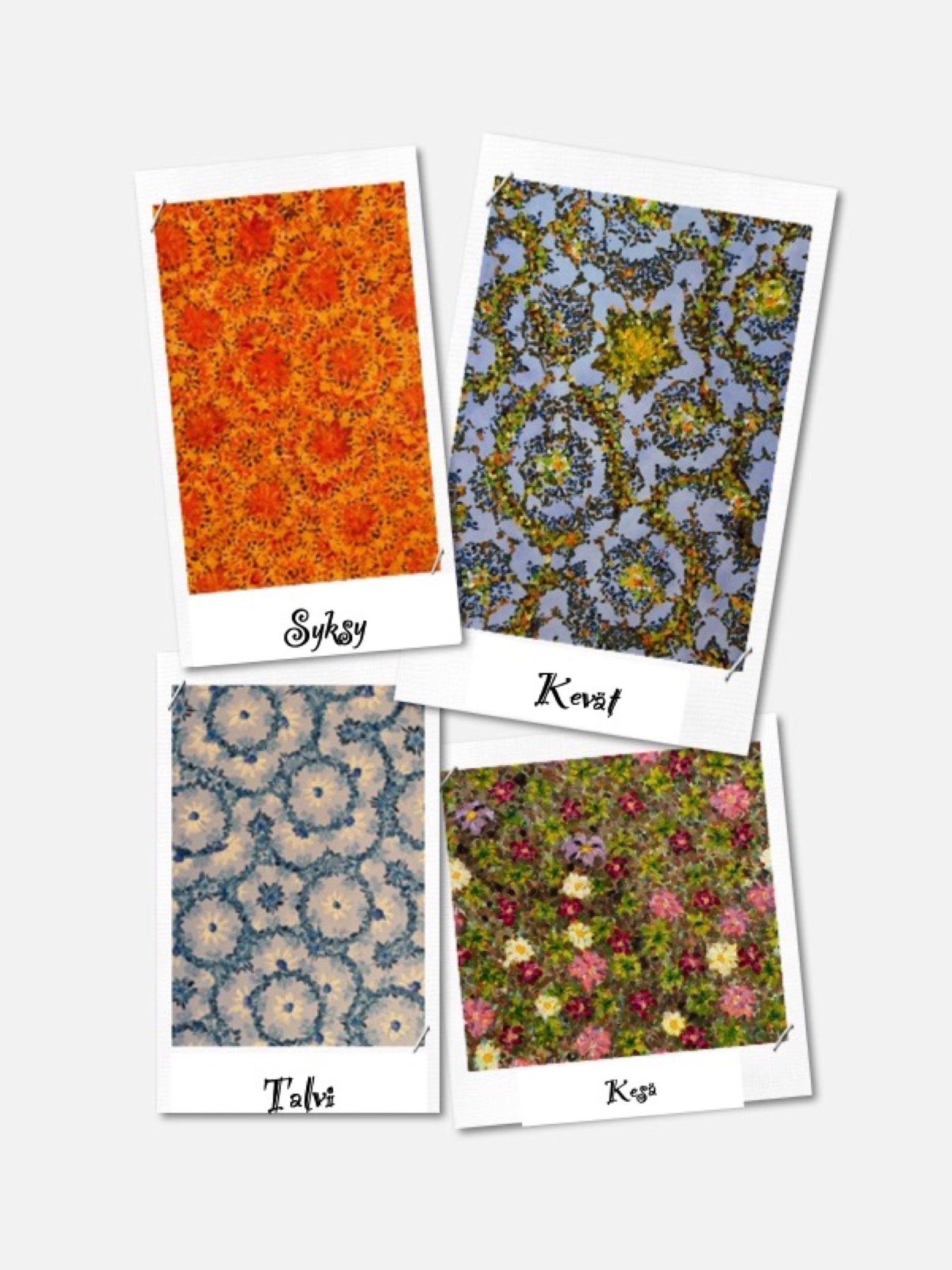
I’ve been trying to make mandala patterns with oil paints. (Mandala is Sanskrit and means a circle or a disc-shaped object. In Hinduism and Buddhism it is a symbolic pattern used in sacred rituals and as an aid to meditation.) In fact, painting in general is quite meditative. Here is one mandala that has been waiting for its next step. Work on this one has stalled, as I haven’t really come up with a fun twist for it.
A mandala as such didn’t really feel like my thing. I decided to do things a little differently and approached it from my own meditative angle. These paintings have recurring rhythm, light and lots of interesting things to look at. The pictures practically demand that the viewer stop. Stopping makes it possible to discover different paths and patterns. The secret is that you pause for a moment on something that halts everyday, stressful thinking.
Winter
This winter painting was the first one I made. While painting it I realised right away that this is a fascinating pattern and it looks interesting. This oil painting measures 1 m x 50 cm. What makes the pattern fascinating is that it has lots of recurring elements, yet no line really repeats. Maybe you’ll find the ice crystals of a cold winter in it.
Spring
Spring was the most challenging of the paintings. At first it had much more clearly defined flowers, which actually belonged to summer. I faded the flowers out and gave the painting more of the freshness and brightness of spring. Can you find lines it shares with winter?
Summer
The summer painting was originally much more yellow. While painting the flowers I made it a little darker, which helped the flowers show and stand out better. Can you find the same lines in the summer painting as in the others?
Autumn
Autumn was the last of the paintings to be made. My original idea was to make autumn browner in tone. I thought about my autumn-themed paintings and decided that this one, too, would get more light and colour.
All four paintings are oil paintings of the same size. They are a metre high and 50 cm wide.
I think of each painting as the human mind at different moments. Lots of thoughts, stimuli pulling in different directions, and never a moment to stop. The patterns depict the movement of the mind. Thoughts leap between negative and positive, seek confirmation from one another, cling to memories, learned patterns and past experiences. One thought gives rise to another – and soon the mind is full of a story we have built ourselves in our imagination.
Look at the background of the paintings. See past the patterns to the single colour. It is quiet, steady and peaceful. It doesn’t demand attention, but it carries everything else. In that colour lies a space where there are no thoughts yet – or where they no longer rule. A peace that is always present, even when the mind is churning on the surface.
Reaching this peace is possible for each of us. But it doesn’t happen by forcing it or by fighting our thoughts. It begins with awakening: with recognising our own thought patterns and seeing how they steer us.
When you recognise thoughts as thoughts – not truths – the background colour begins to show more clearly.
And perhaps then the winter landscape isn’t cold after all, but clear and calm.
The pattern I’ve used in the paintings is a so-called Penrose tiling, a way of covering a plane with two kinds of shapes so that the same pattern never repeats in exactly the same way. Even though the lines are arranged without regular repetition, they still form a fascinating, continuous and orderly surface. Mathematically the pattern is based on the golden ratio, which gives the structure five-fold symmetry. Named after its inventor Roger Penrose, the method revolutionised our understanding of how complex structures can arise from simple parts. The pattern is related to the girih ornamentation used in the Middle East, so these paintings didn’t end up all that far from mandalas after all.
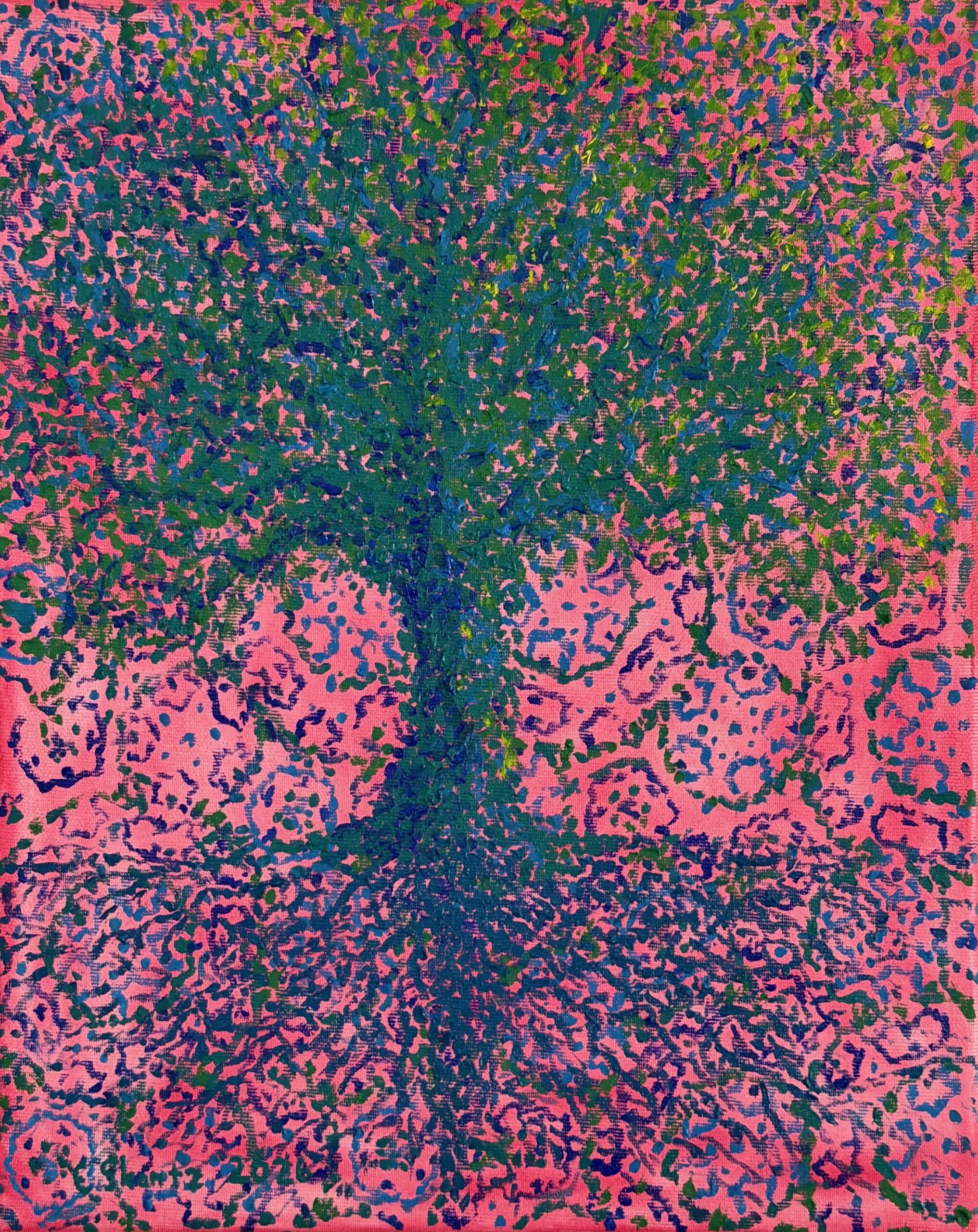
Here we go again with a celebration of colour and play… This time the subject is the tree of life. The tree of life is a mythical tree known in many cultures, binding heaven and earth together or holding up the sky.
This interesting oil painting was made in two stages. First I made an exciting underpainting, which almost disappeared into the background behind the subject. Then again, the tree of life turned out so nicely that it suits that unusual background very well.
Here is the original underpainting of the oil painting. A little of the sketch of the tree is already visible here. Notice that intriguingly repeating background pattern.
I had bought oil paints that I planned to use for this painting. I thought I’d use a very limited palette with nothing but different shades of blue and green… I thought these new colours would stand out beautifully against that reddish background.
Looking at the almost finished painting, I noticed that the blue and green worked well. Still, I wanted to emphasise the mood of light and shadow by adding a slightly “yellower” green on the light side and at the very tops of the tree.
This is what the finished oil painting looks like. This oil painting measures 41 x 33 cm
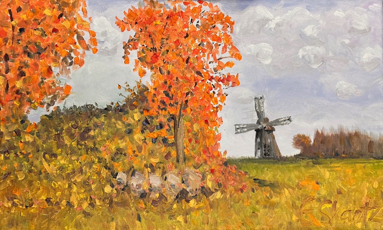
There’s no end of things to paint in my home region! This work is part of my own “This is how I see Mikkeli” series, in which I try to capture familiar landscapes from my own point of view – with colour, light and atmosphere. You’ll find other oil paintings here that tell stories of familiar places, too.
In this painting I wanted to capture the old Otava mill, that sturdy building with its beautiful patina of age. But finding the perfect angle wasn’t exactly a Sunday stroll – it took some serious trudging across a damp autumn field. At times it felt as if my feet were sinking into the clay like an artist’s inspiration into everyday chores.
But that little slog paid off: in the foreground of the mill sat a thicket beautifully tinted with autumn colours, bringing warmth and softness to the work. Nature knows how to compose – and sometimes it demands that the artist play by its rules. The Otava mill painting is one of my first oil paintings that was starting to become what I myself wanted from my paintings.
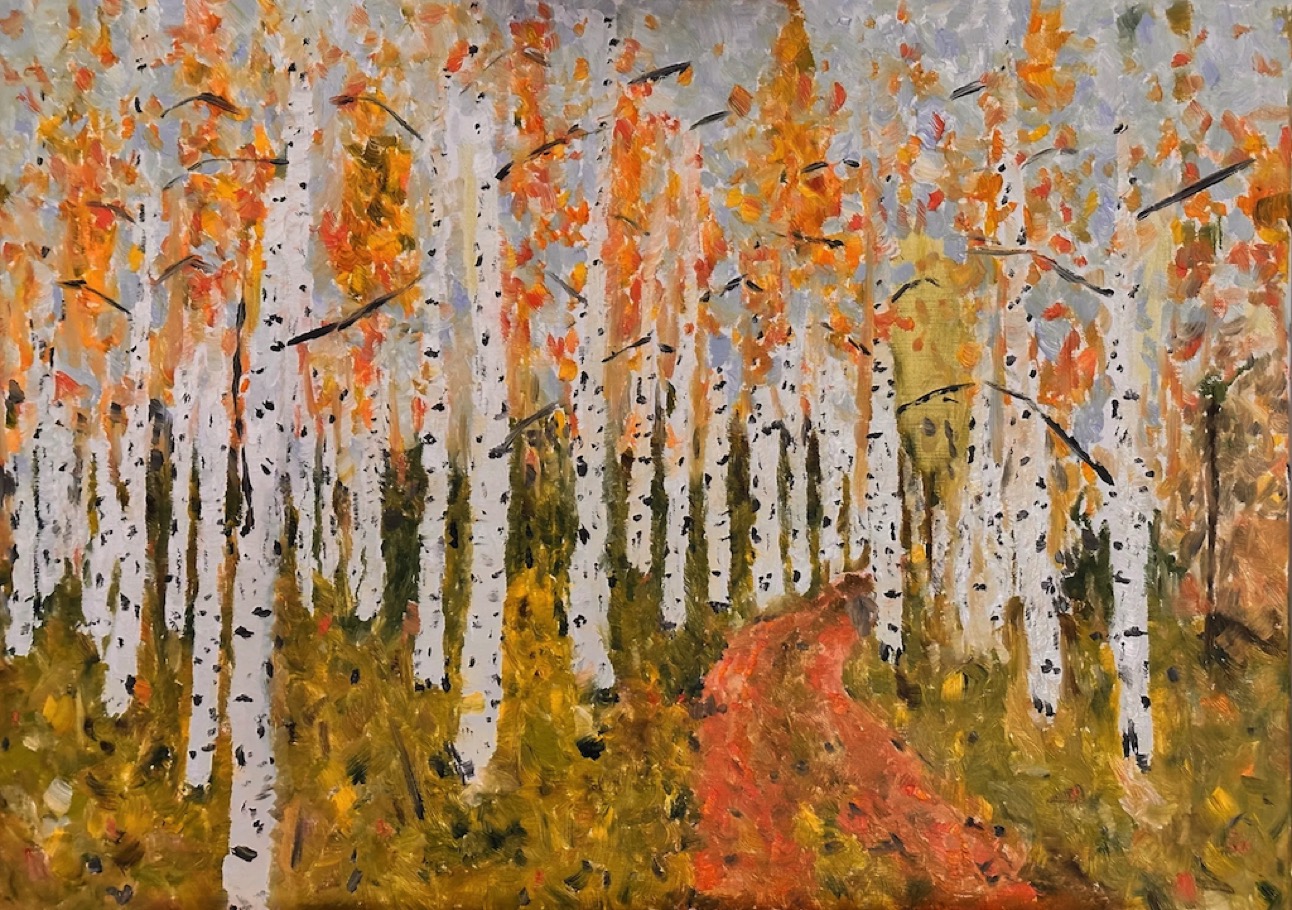
This birch grove is found along the road home. Autumn colours at their finest. This painting has a touch of the spirit of Reidar Särestöniemi – light and glow. Nature was already my inspiration in these early paintings.
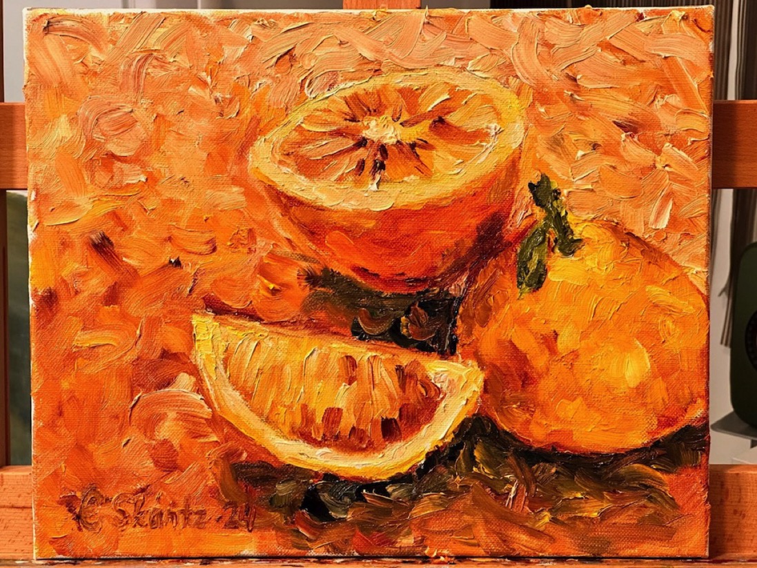
These oranges were inspired by good flavours – a companion piece for the Limes painting. The relaxed painting style is easy to see in the background of the oranges.
Here is a video of about a minute showing how the painting came about.
This shows that painting doesn’t have to be mentally draining.
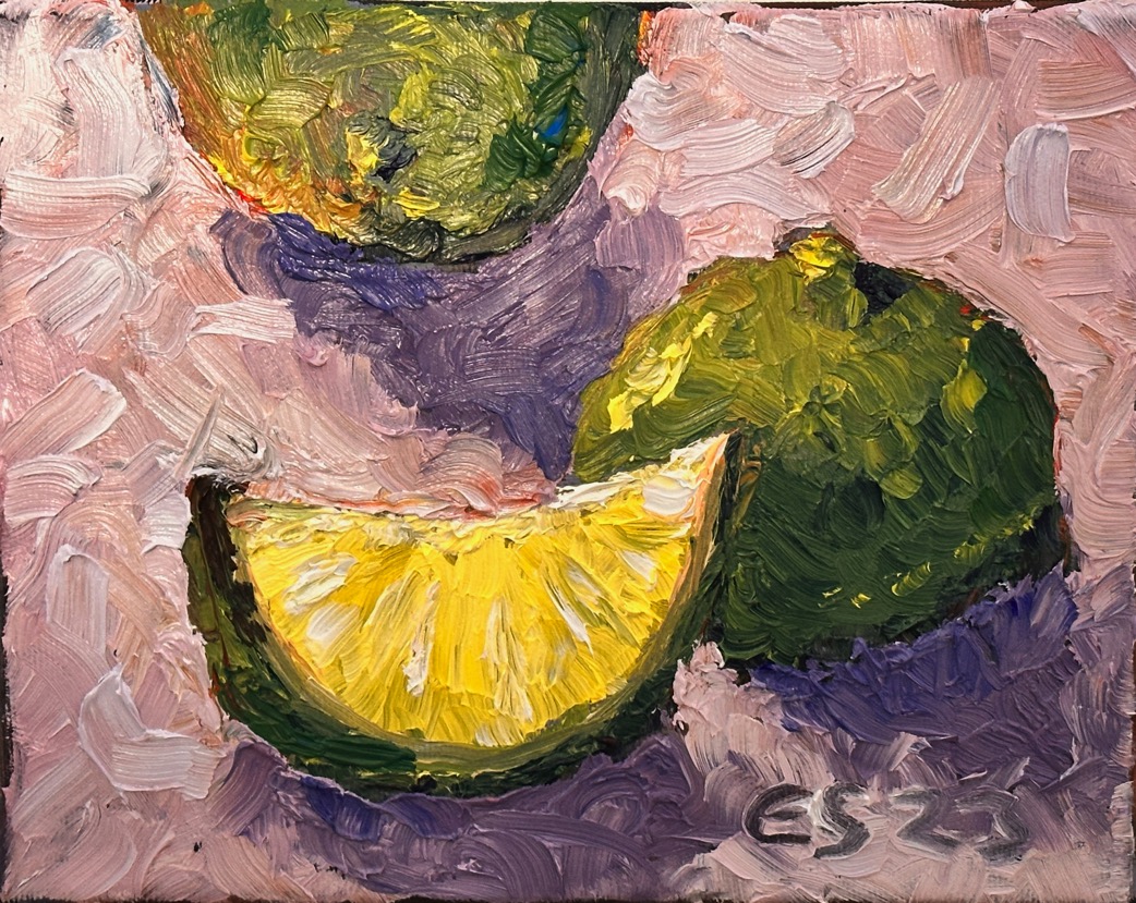
I wanted to paint limes glowing with light. The Limes painting is smaller than Blood oranges, but making it turned out to be more challenging. The blood oranges were painted soon after the limes,
During this painting process, the background of the oil painting gave me some challenges. Here is one example of how some colours just don’t seem to work together. Going back to square one helped in this case.
The first version of the limes was painted on a red background. The background felt a little too strong – almost as if it were on fire. The work came together quickly and I had already signed it. Looking at it, I decided the background needed to be darker. The limes didn’t stand out well enough.
I tried to darken the background by adding blue. The lights and shadows got mixed up. The result was close to a disaster. The old saying “don’t overwork a painting” echoed in my mind. The background was now completely ruined. If I had let go of the work earlier, I wouldn’t have ended up in this mess.
While the paint is still wet, it’s easy to go back to square one. Oil paint is an easy medium in the sense that you can “carve” everything off with a palette knife if you want. I decided the work would get a completely new background colour, something that felt good. In my opinion the result turned out perfectly.